A status page with a dozen services, a maintenance schedule and an incident history can turn into a page visitors scroll through for ages before they find anything to act on. Organizing a status page into two columns puts your service list on the left and planned maintenance plus the subscribe form on the right, so the parts people act on stay visible without hiding or reordering a single piece of information.
When does a status page actually need two columns?
A single column works fine for a small page: five or six services, maybe one upcoming maintenance window, a subscribe box at the bottom. Everything a visitor needs is one or two scrolls away.
The problem shows up once the service list grows. Add a dozen services across a few groups — Website, API, Email, Mobile — and the page gets long before the maintenance section or the subscribe form ever appears. The form that is meant to capture subscribers during an outage ends up thousands of pixels down, past content most visitors never reach. That's the actual readability problem a two-column layout solves: not that single column looks wrong, but that it stops being scannable once the list is long enough.
If your page is still short, single column remains the right choice — it's the default for a reason, and switching a short page to two columns just leaves one column half-empty.
What a two-column layout changes
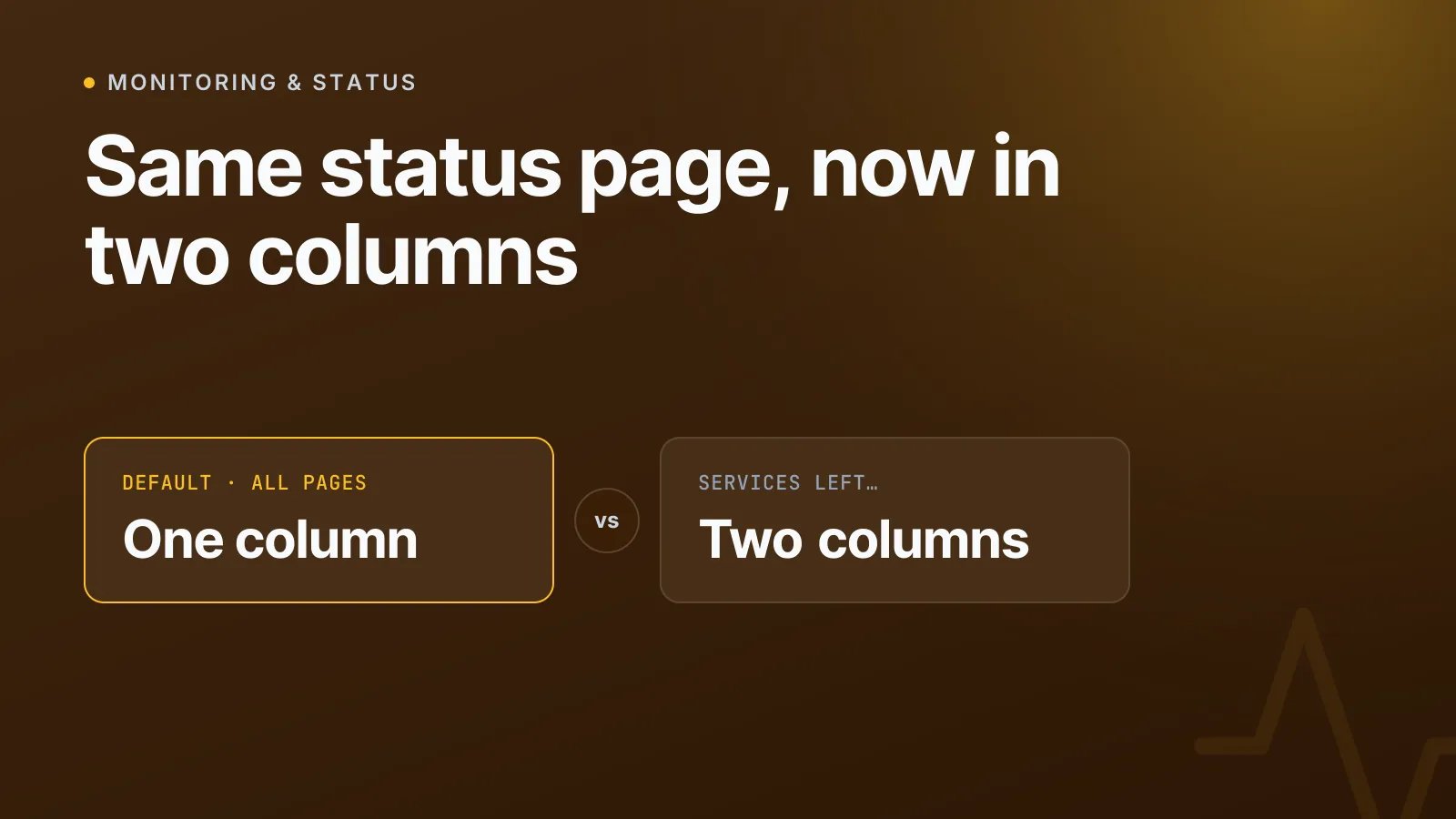
On InfraNest, status pages have a Layout setting with two options: one column or two. One column is what every page starts with and stays the default. Switching to two columns moves your services into a wider left column and puts planned maintenance and the subscribe form into a narrower column beside it — visible the moment the page loads, not after a long scroll.
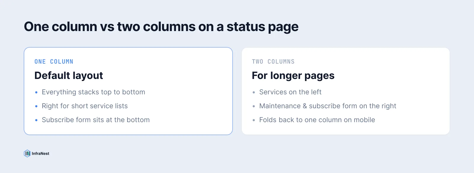
That's the whole change. It's a rearrangement, not a redesign: the same groups, the same service names, the same maintenance windows, just positioned so the page reads in two glances instead of one long one.
What stays exactly the same
This is worth being explicit about, because a layout change is an easy place to accidentally lose something. Both layouts show exactly the same information — nothing is added, hidden or reworded, only moved:
- Every service, group and uptime bar you'd see in one column is still there in two.
- Planned maintenance still shows as planned, never counted as downtime.
- The subscribe form is the same form, just positioned differently.
- Incident history, third-party services and announcements appear in both layouts if you've turned them on.
NoteAnything that is wrong right now stays across the full width at the top, in both layouts. A layout setting can rearrange a page; it can't demote an active outage into a side column where it's easy to miss.
That last point matters more than it sounds. A two-column layout is a convenience for calm days — browsing services, checking maintenance, subscribing. The moment something breaks, the page reverts to behaving like the single most important thing on it: the outage banner, full width, at the top, regardless of which layout you picked.
Where maintenance and the subscribe form actually sit
In the two-column layout, the right-hand column carries planned maintenance and the subscribe form together, beside the services rather than underneath them. That's deliberate — those are the two things a long single-column page most often buries: maintenance notices that visitors should see before they open a ticket, and the form that turns a one-time visitor into someone who gets emailed the moment something changes. Keeping them beside the service list rather than below it means they're visible without a visitor needing to know they exist and scroll looking for them.
What happens on a phone
There's no room for two columns on a phone screen, so a two-column page folds back into one automatically. Nothing is lost in the process — the side column (maintenance and subscribe) lands underneath the services, in the same order it would appear if the page were single column to begin with. You don't need a separate mobile layout decision; it's handled for you.
Pairing the layout with other appearance settings
Layout is one setting among several worth looking at together if your status page has grown. Spacing can be set to Compact to fit more services on screen without hiding anything — it only tightens the rows, never removes a section. Colour scheme can follow Auto, which keeps matching a visitor's device even if they switch from light to dark mid-incident. And History shown (30, 60 or 90 days) controls how far back the uptime bars and incident list reach, which also affects how long the single-column version of the page runs before it needs two columns at all.
If you're also thinking about how incidents on the page connect to your support workflow, see linking status page incidents to support conversations — a permanent incident URL is useful however the page is laid out.
How to switch your status page to two columns
- Open your status page and go to Settings → Appearance.
- Under Layout, choose Two columns. A small preview shows the difference before you commit.
- Check the live preview beside the settings — it shows your real services, not placeholder content.
- Save. The change applies immediately, on your custom domain and the hosted URL alike.
There's nothing to migrate and no content to re-enter: the layout only moves what's already on the page. If a two-column page later feels wrong for a smaller service list, switching back to one column is the same two clicks.
A status page exists so people can answer "is this broken?" without opening a ticket. Keeping the service list, maintenance and subscribe form all visible without an unnecessary scroll is a small thing, but it's the difference between a page that gets used and one that gets ignored. See the full set of layout and branding options on the status pages feature page.
Frequently asked questions
#Does switching to a two-column layout hide any information from visitors?
No. Both layouts show exactly the same services, maintenance windows, incident history and subscribe form — the two-column layout only repositions them. Nothing is added, hidden or reworded.
#What happens to the two-column layout on mobile devices?
There's no room for two columns on a phone screen, so the page automatically folds back into a single column. The side column (maintenance and the subscribe form) simply lands underneath the services, in the same order it would use in single-column mode.
#Will an active outage ever appear in the side column instead of at the top?
No. In both layouts, anything currently wrong stays across the full width at the top of the page. The layout setting can rearrange calm-day content like maintenance and the subscribe form, but it never demotes a live incident into a side column.
#Should a small status page with only a few services use two columns?
Probably not yet. Two columns helps once a long service list has pushed the subscribe form far down the page; on a short page, one column keeps everything visible in a single glance and is the better default.
Try it with a free tool
Was this article helpful?